



Executive summary
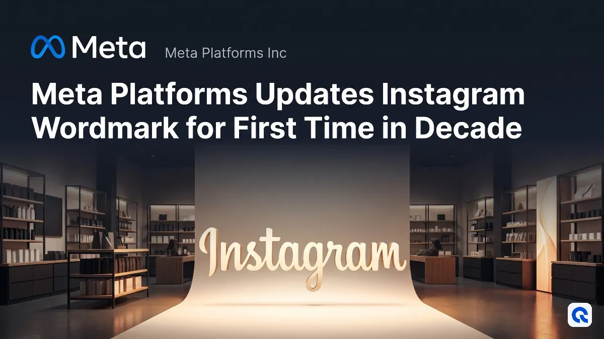
Instagram introduced a redesigned wordmark at the top of its app, marking the first typography update in ten years. The new design blends cursive and print lettering for a cleaner, more modern look, while the familiar gradient camera icon remains untouched. The refresh is part of a broader brand update that includes new fonts and design elements rolling out through 2026.
What happened
Instagram unveiled a redesigned wordmark-the stylised text logo at the top of the app-replacing the cursive script that had been in place since the platform's early years. Instagram head Adam Mosseri announced the change, describing it as cleaner and more modern while maintaining references to the original design. The new wordmark blends cursive and print lettering, with some letters connected and others standing alone. Instagram's design team explored hundreds of options before settling on the hybrid script design. The update is part of a broader brand refresh that includes an updated Instagram Sans typeface and two new fonts: Instagram Pen and Instagram Mono. The changes are rolling out globally now, with additional design updates planned through 2026 and beyond. Notably, Instagram's iconic gradient camera icon on users' home screens remains completely unchanged.
Why it matters
The wordmark refresh signals Instagram's first major visual identity update in ten years, reflecting the platform's evolution from a simple photo-filtering tool into a broad media platform encompassing video, messaging, and shopping. By updating only the wordmark rather than the widely recognised home screen icon, Meta balances brand modernisation with user familiarity. The new design aims to reflect individual expression and personal voice, qualities Instagram considers core to its platform. However, the update has sparked mixed reactions online, with some users struggling to see the difference and others criticising the distinctive shapes of certain letters-particularly the s and r-which led to jokes that the logo reads Instagzam. Despite the polarised response, Instagram's strong brand recognition means the typography change is unlikely to confuse users or disrupt engagement.
Bigger picture
Instagram's refresh follows a long-standing trend among major tech platforms toward minimalist branding. The last time Instagram made a comparable change was in 2016, when it replaced its retro brown camera icon with the flat gradient square still used today-a shift that also faced backlash. That redesign reflected Instagram's transformation into a comprehensive media platform after Meta (then Facebook) acquired it for $1 billion in 2012. Since launching in October 2010, Instagram has grown from 25,000 users on its first day to one of the world's most influential social media platforms. The current update is more modest, touching marketing materials and app headers without altering the home screen icon that sits on billions of smartphones. The broader brand refresh, including new motion design and restrained use of Instagram's signature gradient, suggests Meta is positioning Instagram for continued evolution as user expectations and platform capabilities change.
What to watch
Watch for the rollout of additional design changes throughout 2026 and beyond, including refreshed motion, layouts, and more restrained use of Instagram's signature gradient. Monitor user reaction as the new wordmark becomes more widely visible across the platform and whether Meta makes further adjustments in response to feedback. Pay attention to whether Meta eventually updates the home screen icon or introduces other visual identity changes as Instagram continues evolving its platform capabilities. Also watch for how the new Instagram Pen and Instagram Mono fonts are integrated into the user experience and whether they influence content creation tools or branding across Meta's broader ecosystem.
Get our top market beating stocks free here
#branding
#product update